Features
- 10 Unique Layouts: Each template is designed to cater to different professions.
- Creative Architecture Team
- Creative Business Team
- Creative Chefs
- Creative Corporative Team
- Creative Gym & Fitness Trainer Team
- Creative Jewellery Store Team
- Creative Real Estate Agent Team
- Creative Salon Team
- Creative SEO Team
- Creative Team of Accountants
- Google Fonts: Fonts used in these templates are sourced from Google Fonts.
- Font Awesome: Icons used are from Font Awesome.
- Unsplash: Images used in the templates are sourced from Unsplash.
Credits
Note
Images are not included in the main templates.
Free Integration Service
We also offer free integration of these designs into your website. Contact us with your requirements, and we’ll ensure the templates fit seamlessly into your site.
FAQ
1. Are the images included in the templates?
No, images are not included in the main templates. You can replace them with your own or source them from platforms like Unsplash.
2. Can I customize the templates to fit my branding?
Yes, the templates are easy to customize with well-structured HTML and CSS files. You can adjust colors, fonts, and layouts to match your branding.
3. How can I integrate these templates into my website?
We offer free integration services. Simply contact our support team with your website details, and we’ll assist you in seamlessly integrating these templates.
Features:
- Build with Tailwind CSS
- Responsive for all devices
- RTL & LTR mode supported
- Light & Dark mode supported
- 15+ demo pages
- Life time free updates
- W3C Validated code
Customer Support:
Our dedicated support team is ready to assist you. Contact us for any issues or pre-sale questions, and we’ll respond within 1 or 2 working days. Your success is our priority!Note: This is pure HTML 5 template not a WordPress theme.]]>
Auth Bliss is a sleek and modern set of authentication forms designed to provide a seamless user experience. With its clean design and responsive layout, Auth Bliss is the perfect solution for integrating authentication processes into your web projects.
Key Features:
- No Bootstrap: Built without Bootstrap for a lightweight and fast-loading solution.
- No jQuery: Utilizes Vanilla JavaScript, eliminating the need for jQuery.
- HTML5: Modern and semantic HTML5 markup.
- Vanilla JavaScript: Pure JavaScript for optimal performance.
- CSS3: Advanced styling with CSS3.
- Cross-Browser Compatibility: Works seamlessly across all major browsers.
- Modern & Clean Design: Sleek and contemporary visual aesthetics.
- Up to 6 Forms: Includes templates for six different authentication processes.
- Responsive Design: Fully responsive, ensuring a great user experience.
- Easy Setup: Simple to integrate and deploy.
- W3C Validated: Code is validated according to W3C standards.
Files Included:
- assets: Contains various assets used in the forms, such as CSS stylesheets, JavaScript files, images, and Font Awesome icons.
- account-locked.html: Displays the “Account Locked” scenario, allowing users to regain access to their account.
- forgot-password.html: Provides a form for users to enter their registered email address to initiate a password reset request.
- login.html: Contains fields for username/email and password input to facilitate user login.
- register.html: Allows users to fill out their name, email, and password to create a new account.
- reset-password.html: Presents a form for users to enter a new password after verifying their identity.
- two-factor-authentication: Adds an extra security step by requiring users to enter a verification code in addition to their password.
Enhance your website’s authentication process with Auth Bliss – the set of mobile-friendly auth forms!
]]>Auth Bliss is a sleek and modern set of authentication forms designed to provide a seamless user experience. With its clean design and responsive layout, Auth Bliss is the perfect solution for integrating authentication processes into your web projects.
Key Features:
- No Bootstrap: Built without Bootstrap for a lightweight and fast-loading solution.
- No jQuery: Utilizes Vanilla JavaScript, eliminating the need for jQuery.
- HTML5: Modern and semantic HTML5 markup.
- Vanilla JavaScript: Pure JavaScript for optimal performance.
- CSS3: Advanced styling with CSS3.
- Cross-Browser Compatibility: Works seamlessly across all major browsers.
- Modern & Clean Design: Sleek and contemporary visual aesthetics.
- Up to 6 Forms: Includes templates for six different authentication processes.
- Responsive Design: Fully responsive, ensuring a great user experience.
- Easy Setup: Simple to integrate and deploy.
- W3C Validated: Code is validated according to W3C standards.
Files Included:
- assets: Contains various assets used in the forms, such as CSS stylesheets, JavaScript files, images, and Font Awesome icons.
- account-locked.html: Displays the “Account Locked” scenario, allowing users to regain access to their account.
- forgot-password.html: Provides a form for users to enter their registered email address to initiate a password reset request.
- login.html: Contains fields for username/email and password input to facilitate user login.
- register.html: Allows users to fill out their name, email, and password to create a new account.
- reset-password.html: Presents a form for users to enter a new password after verifying their identity.
- two-factor-authentication: Adds an extra security step by requiring users to enter a verification code in addition to their password.
Enhance your website’s authentication process with Auth Bliss – the set of mobile-friendly auth forms!
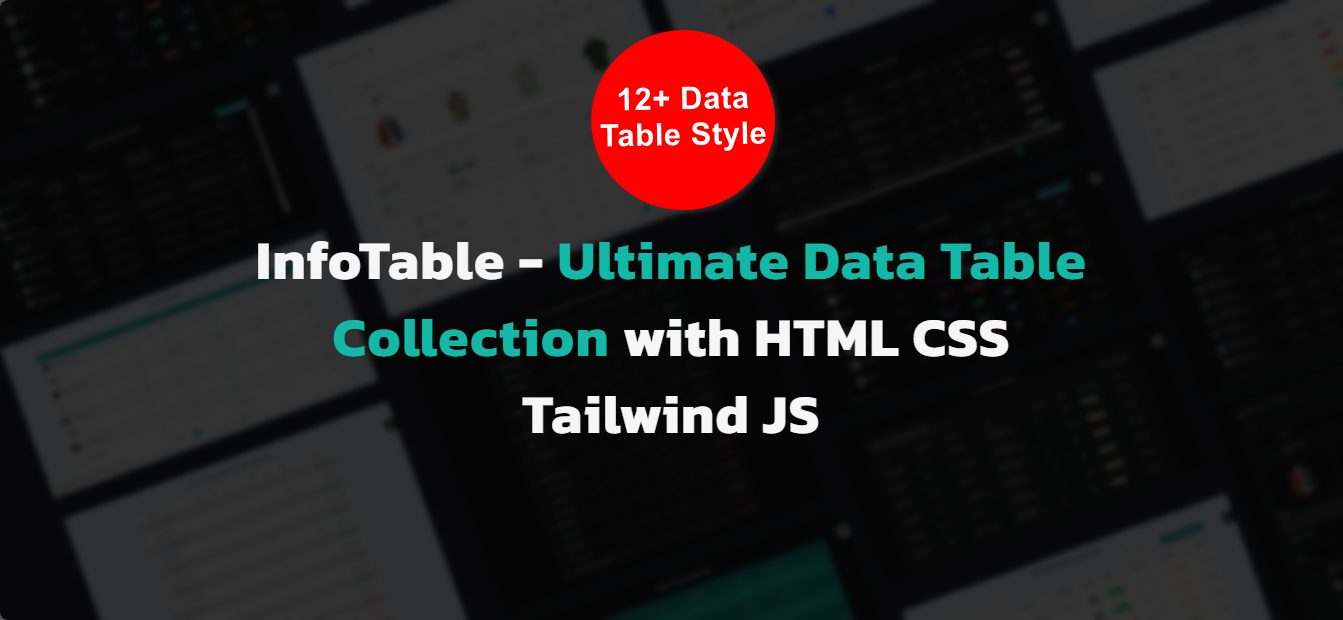
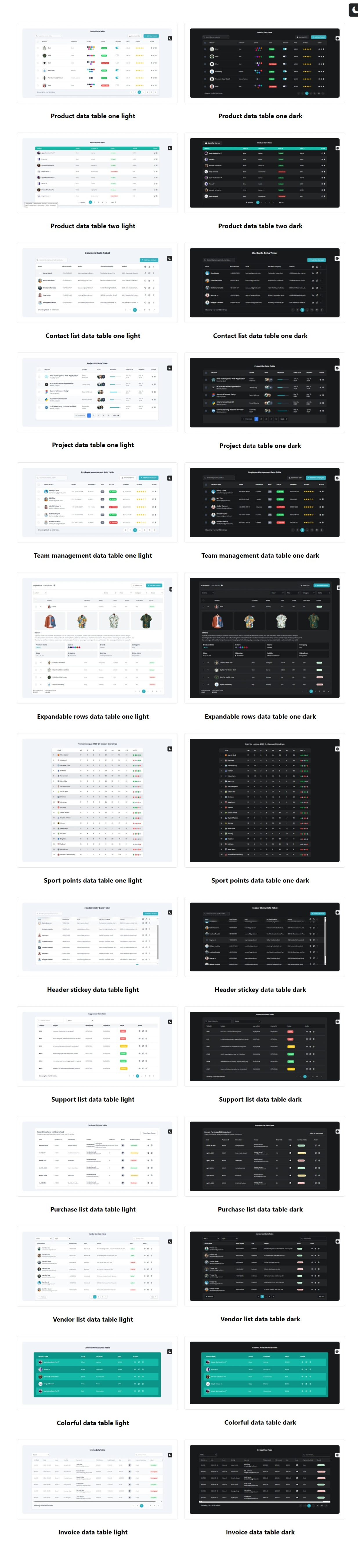
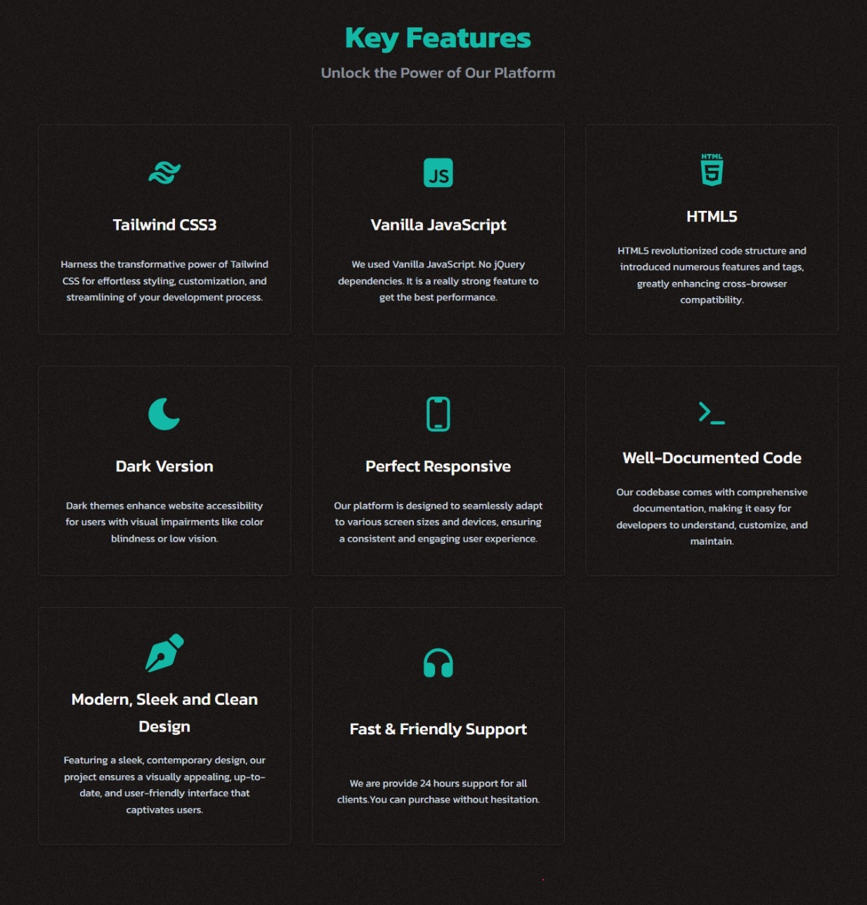
]]>InfoTable – is a comprehensive data table collection featuring over 12 unique styles, built with Tailwind CSS v3+, HTML5, CSS3, and Vanilla JavaScript. It includes various tables like team management, user management, invoices, vendor, sports points, and multiple product tables. Key features include advanced functionalities like expandable rows, pagination, filters, and a modern, responsive design. Easy to set up and W3C validated, InfoTable ensures a sleek and clean look for your data presentation needs, backed by 24/7 support. Perfect for creating organized, professional tables effortlessly.
Read Documentation:
Key Feature:
- Html, CSS, JavaScript and TailwindCSS
- Built with the Latest Tailwind CSS V3+
- 12+ different various Data Table Styles
- 4+ Product Table Styles
- Advanced, Expended rows, Pagination, Filter, Invoices
- Contact List, Point Table, Sales etc. Data Tables
- Modern, Sleek and Clean Design
- Modern and Clean Design
- Glass morphism Design included
- Comes with Comprehensive Documentation and Clean Code
- Quick and Easy Setup
- Clean and commented code
- W3 Validated Code
- Ensures 100% Responsive Layouts
- Available in both Light and Dark Modes
- 24/7 Customer Support
Files Included:
- colorful-data-table.html
- contact-list-data-table.html
- expandable-rows-table.html
- header-sticky-data-table.html
- modal-cards.html
- invoice-data-table.html
- product-data-table-two.html
- product-data-table.html
- project-data-table.html
- purchase-list-data-table.html
- sport-points-table.html
- support-list-data-table.html
- team-management-data-table.html
- vendor-list-data-table.html
- one html documentation file
Source & Credits:
- Google Fonts
- Talwind CSS 3+
- Font Awesome
- FreepiK
- Icons8
- Autoprefixer
- PostCSS
Please Note:
Note: All images are just used for Preview Purpose Only. They are not part of the html templates and no included in the final purchase files.
]]>Descriptions:
Create stunning knockout text effects with ease using this versatile HTML and CSS package. With six unique styles to choose from, you can effortlessly enhance your web designs. Simply insert the provided HTML code and customize the CSS to match your desired look. Elevate your website’s aesthetic with eye-catching knockout text effects today!Features
- HTML5 and CSS3
- No plugin or Jquery is used
- No JavaScript is used
- Responsive Design
- Six Design Styles
- W3C Valid Markup
- Clean, Modern, Minimal, Creative & Stylish Design
- Easy to Customize
- Cross Browser Compatible
- Used Google Fonts
- Single layout
- Well Commented and Clean Codes
- Copy & Paste – paste it into your project
- Easily Customizable – Customize without coding
What do you get?
- HTML file
- CSS file
- Documentation file
Fonts Credits
Important Note
Note: This is purely made with html and css. This is not a WordPress plugin or not dynamic no PHP is used. Images are only used as demonstration and are not included in the downloaded zip folder.Support
Please don’t hesitate to reach out to us whenever you need assistance. Our committed team is here to offer you top-notch support. You can get in touch with us through our Theme-Forest profile or by emailing us at [email protected]. We will prioritize resolving your problem promptly. If you’re satisfied with our service, we would greatly appreciate a 5-star rating!]]>Descriptions:
Elevate your website’s design with Creative Typing Text Effects! With three mesmerizing styles, bring your text to life in a way that’s both visually striking and engaging. Whether you’re a YouTuber, Coder, Designer, or Creative, these animations offer a seamless blend of creativity and innovation to captivate your audience.Features
- HTML5 and CSS3
- No plugin or Jquery is used
- No JavaScript is used
- Responsive Design
- Three Design Styles
- W3C Valid Markup
- Clean, Modern, Minimal, Creative & Stylish Design
- Easy to Customize
- Cross Browser Compatible
- Used Google Fonts
- Single layout
- Well Commented and Clean Codes
- Copy & Paste – paste it into your project
- Easily Customizable – Customize without coding
What do you get?
- HTML file
- CSS file
- Documentation file
Fonts Credits
Important Note
Note: This is purely made with html and css. This is not a WordPress plugin or not dynamic no PHP is used. Images are only used as demonstration and are not included in the downloaded zip folder.Support
Please don’t hesitate to reach out to us whenever you need assistance. Our committed team is here to offer you top-notch support. You can get in touch with us through our Theme-Forest profile or by emailing us at [email protected]. We will prioritize resolving your problem promptly. If you’re satisfied with our service, we would greatly appreciate a 5-star rating!]]>Descriptions:
Enhance your website’s cards/social section with our ZigZag Border Animation component. This engaging and interactive element, built using HTML & CSS only, brings a fresh and dynamic approach. The animation effect adds a modern touch, while the smooth animations captivate your visitors. Easily integrate this responsive and user-friendly feature into your web project and impress your audience with a stylish presentation.Features
- HTML5 and CSS3
- No plugin or Jquery is used
- No JavaScript is used
- Responsive Design
- W3C Valid Markup
- Clean, Modern, Minimal, Creative & Stylish Design
- Easy to Customize
- Cross Browser Compatible
- Used Google Fonts
- Single layout
- Well Commented and Clean Codes
- Copy & Paste – paste it into your project
- Easily Customizable – Customize without coding
What do you get?
- HTML file
- CSS file
- Documentation file
Fonts Credits
Important Note
Note: This is purely made with html and css. This is not a WordPress plugin or not dynamic no PHP is used. Images are only used as demonstration and are not included in the downloaded zip folder.Support
Please don’t hesitate to reach out to us whenever you need assistance. Our committed team is here to offer you top-notch support. You can get in touch with us through our Theme-Forest profile or by emailing us at [email protected]. We will prioritize resolving your problem promptly. If you’re satisfied with our service, we would greatly appreciate a 5-star rating!]]>Features:
- Creative, Modern, and Clean Design
- 8 Different Responsive Team Section
- Ready to Use
- Built with HTML5 & CSS3
- W3C Validate Code
- SASS CSS
- Fully Responsive
- Clean and Commented Code
- Easy to Use
- Well Documentation
- Easy Customization
- Free Future Updates
- 24/7 Awesome Support
- And Many More…
For Developers:
- You can boost your development with TeamXtra on HTML and CSS
Browser Compatibility:
- Chrome (Windows, Mac, Linux) Firefox (Windows, Mac, Linux) Safari (Mac) Microsoft Edge and Other WebKit Browsers
Files Included:
- HTML Files
- Documentation
Font Used:
Icons Used:
Please Note:
- Images used in demo are not included in download version.
Features:
- Creative, Modern, and Clean Design
- 8 Different Responsive Team Section
- Ready to Use
- Built with HTML5 & CSS3
- W3C Validate Code
- SASS CSS
- Fully Responsive
- Clean and Commented Code
- Easy to Use
- Well Documentation
- Easy Customization
- Free Future Updates
- 24/7 Awesome Support
- And Many More…
For Developers:
- You can boost your development with TeamXtra on HTML and CSS
Browser Compatibility:
- Chrome (Windows, Mac, Linux) Firefox (Windows, Mac, Linux) Safari (Mac) Microsoft Edge and Other WebKit Browsers
Files Included:
- HTML Files
- Documentation
Font Used:
Icons Used:
Please Note:
- Images used in demo are not included in download version.
Features of the Password Keeper Web Application 1. User Authentication
Master Password Login: The application requires a master password to access the password manager section, providing an initial layer of security.2. Password Management
Add Passwords: Users can add new passwords by entering the site name, URL, username, and password.
Edit Passwords: Existing passwords can be edited by populating the form with the current password details.
Delete Passwords: Users can delete passwords they no longer need, ensuring their password list remains up-to-date and manageable.
3. Password Encryption
Encryption: Passwords are encrypted using AES (Advanced Encryption Standard) to ensure they are stored securely in the browser's local storage.
Decryption: Encrypted passwords are decrypted when needed to display the actual password to the user.
4. Password Visibility Toggle
Show/Hide Password: Users can toggle the visibility of each password, allowing them to see or hide the actual password as needed.5. Password Strength Indicator
Visual Indicator: A dynamic visual indicator displays the strength of the password based on its length, the use of lowercase and uppercase letters, numbers, and special characters.
Strength Categories: Passwords are categorized as weak, medium, or strong based on the above criteria.
6. Password Generation
Random Password Generator: Users can generate strong, random passwords with a click of a button, ensuring they have access to secure passwords without the need to create them manually.7. Import and Export Passwords
Export Passwords: Users can export their passwords to a JSON file, allowing them to back up their data or transfer it to another device.
Import Passwords: Passwords can be imported from a JSON file, making it easy to restore or migrate password data.
8. Responsive Design
Adaptable Layout: The application is designed to work seamlessly across various devices (Desktop, Tab) and screen sizes, ensuring a consistent user experience.9. Secure Storage
Local Storage Management: Passwords are securely stored in the browser's local storage, reducing the risk of unauthorized access compared to remote storage solutions.10. User-Friendly Interface
Clean and Simple Design: The user interface is designed to be intuitive and easy to navigate, with clear forms and buttons.
Form Validation: Forms include basic validation to ensure that all necessary fields are completed before submission.
11. Accessibility Features
Keyboard Navigation: The application supports basic keyboard navigation for better accessibility.
Focus Styles: Focus styles are included to help users navigate the application using a keyboard.Features of the Password Keeper Web Application 1. User Authentication
Master Password Login: The application requires a master password to access the password manager section, providing an initial layer of security.2. Password Management
Add Passwords: Users can add new passwords by entering the site name, URL, username, and password.
Edit Passwords: Existing passwords can be edited by populating the form with the current password details.
Delete Passwords: Users can delete passwords they no longer need, ensuring their password list remains up-to-date and manageable.
3. Password Encryption
Encryption: Passwords are encrypted using AES (Advanced Encryption Standard) to ensure they are stored securely in the browser's local storage.
Decryption: Encrypted passwords are decrypted when needed to display the actual password to the user.
4. Password Visibility Toggle
Show/Hide Password: Users can toggle the visibility of each password, allowing them to see or hide the actual password as needed.5. Password Strength Indicator
Visual Indicator: A dynamic visual indicator displays the strength of the password based on its length, the use of lowercase and uppercase letters, numbers, and special characters.
Strength Categories: Passwords are categorized as weak, medium, or strong based on the above criteria.
6. Password Generation
Random Password Generator: Users can generate strong, random passwords with a click of a button, ensuring they have access to secure passwords without the need to create them manually.7. Import and Export Passwords
Export Passwords: Users can export their passwords to a JSON file, allowing them to back up their data or transfer it to another device.
Import Passwords: Passwords can be imported from a JSON file, making it easy to restore or migrate password data.
8. Responsive Design
Adaptable Layout: The application is designed to work seamlessly across various devices (Desktop, Tab) and screen sizes, ensuring a consistent user experience.9. Secure Storage
Local Storage Management: Passwords are securely stored in the browser's local storage, reducing the risk of unauthorized access compared to remote storage solutions.10. User-Friendly Interface
Clean and Simple Design: The user interface is designed to be intuitive and easy to navigate, with clear forms and buttons.
Form Validation: Forms include basic validation to ensure that all necessary fields are completed before submission.
11. Accessibility Features
Keyboard Navigation: The application supports basic keyboard navigation for better accessibility.
Focus Styles: Focus styles are included to help users navigate the application using a keyboard.Features:
- Built with Tailwind CSS
- HTML5 & CSS3 Markup
- Clean & Minimal Design
- Fully Responsive & Mobile-Friendly
- Fully Customizable
- 8 Different Pricing Table Variations
- Retina Display Support
- W3C Valid Files
- Integrated with Google Fonts
- Well-Commented Code
- Comprehensive Documentation
- Easy Customization
Browser Compatibility:
- Chrome (Windows, Mac, Linux)
- Firefox (Windows, Mac, Linux)
- Safari (Mac)
- Microsoft Edge
- Other WebKit Browsers
Important Note: Windful Pricing Table components is a static Tailwind HTML5 template and not a WordPress theme.
]]>Features:
- Built with Tailwind CSS
- HTML5 & CSS3 Markup
- Clean & Minimal Design
- Fully Responsive & Mobile-Friendly
- Fully Customizable
- 8 Different Pricing Table Variations
- Retina Display Support
- W3C Valid Files
- Integrated with Google Fonts
- Well-Commented Code
- Comprehensive Documentation
- Easy Customization
Browser Compatibility:
- Chrome (Windows, Mac, Linux)
- Firefox (Windows, Mac, Linux)
- Safari (Mac)
- Microsoft Edge
- Other WebKit Browsers
Important Note: Windful Pricing Table components is a static Tailwind HTML5 template and not a WordPress theme.
]]>Key Features:
- Responsive Design
- Sleek and Modern Interface
- Tailwind CSS Integration
- Easy Customization
- Multipurpose Usage
- Error Pages Included
- Well-Organized Code
- Comprehensive Documentation
- Seamless User Experience
- Consistent Styling
- Versatile Templates
- Professional Design Elements
That’s Included:
- 23+ Tailwind CSS components
- Responsive design for various devices
- Easy customization with Tailwind CSS
- Optimized performance for faster loading
- Detailed documentation for seamless implementation
TotalSuite is perfect for:
- Register Page
- Login Page
- Coming Soon Page
- Error Page
Image Credits
Please Note:
All images are just used for Preview Purpose Only. This is HTML Template not wordpress Template
]]>
Unlock the Magic of Web Design! Are you ready to elevate your website’s visual
appeal? Look no further! Our
“Falling Elements: CSS Background Animation” CSS code brings life and
emotion to your web pages.
Here’s why you need this delightful
animation:
Captivate Your Audience: Imagine visitors being greeted by a subtle,
mesmerizing hearts, or any elements in the background. It’s not just code;
it’s an experience that tugs at their heartstrings.
Seamless Integration: Our CSS snippet seamlessly integrates into any webpage. Simply drop it into
your existing code, and watch the magic unfold.
Responsive and Lightweight:
Worried about performance? Fear not! Our code is optimized for speed and
responsiveness. It won’t weigh down your site or slow load times. Easy
Customization: Want a different color? Different sizes? Custom
element? No problem! Our well organized CSS classes make customization a
breeze
Features:
- Creative, Modern, and Clean Design
- 8 Different Responsive Pricing Section
- Ready to Use
- Built with HTML5 & CSS3
- W3C Validate Code
- SASS CSS
- Fully Responsive
- Clean and Commented Code
- Easy to Use
- Well Documentation
- Easy Customization
- Free Future Updates
- 24/7 Awesome Support
- And Many More…
For Developers:
- You can boost your development with PricingXtra on HTML and CSS
Browser Compatibility:
- Chrome (Windows, Mac, Linux) Firefox (Windows, Mac, Linux) Safari (Mac) Microsoft Edge and Other WebKit Browsers
Files Included:
- HTML Files
- Documentation
Font Used:
Icons Used:
Please Note:
- Images used in demo are not included in download version.
Key Features:
- Built with Bootstrap SCSS: Leverage the power of Bootstrap for responsive design and effortless customization through SCSS preprocessor.
- Includes Bootstrap dark mode integration for a user-friendly experience in both light and dark themes.
- Multiple Pricing Tiers: Showcase various plans with clear distinctions, making it easy for users to choose the right option.
- Eye-catching Design: Attract attention and enhance conversion rates with a clean and modern layout.
- Flexibility: Easily tailor the template to match your brand identity and specific needs.
- Gulp.js Integration: Streamline your SCSS compilation workflow with pre-configured Gulp tasks (optional).
- CSS Included: Don’t need SCSS? copy only the required styles from the ‘css/styles.css’ file into your project. Additionally, link the Bootstrap and icon CSS separately to your HTML.
Benefits:
- Save Time: Get a head start with a pre-built, responsive pricing table template.
- Boost Conversions: Increase sales with clear and compelling value propositions.
- Effortless Customization: Tailor the design to perfectly match your brand and offerings.
- Improved Workflow: Enjoy a streamlined development experience with Gulp.js (optional).
- Flexibility: Use SCSS for more control or leverage the ready-made CSS for quick implementation.
Ideal For:
- Web developers seeking a quick and efficient solution for creating pricing tables.
- Businesses of all sizes who want to showcase their products or services in a visually appealing way.
- Anyone looking to improve their website’s conversion rates and user experience.
Get Started Today!
Purchase the Bootstrap SCSS Pricing Tables template and start converting your website visitors into paying customers.
]]>Key Features:
- Built with Bootstrap SCSS: Leverage the power of Bootstrap for responsive design and effortless customization through SCSS preprocessor.
- Includes Bootstrap dark mode integration for a user-friendly experience in both light and dark themes.
- Multiple Pricing Tiers: Showcase various plans with clear distinctions, making it easy for users to choose the right option.
- Eye-catching Design: Attract attention and enhance conversion rates with a clean and modern layout.
- Flexibility: Easily tailor the template to match your brand identity and specific needs.
- Gulp.js Integration: Streamline your SCSS compilation workflow with pre-configured Gulp tasks (optional).
- CSS Included: Don’t need SCSS? copy only the required styles from the ‘css/styles.css’ file into your project. Additionally, link the Bootstrap and icon CSS separately to your HTML.
Benefits:
- Save Time: Get a head start with a pre-built, responsive pricing table template.
- Boost Conversions: Increase sales with clear and compelling value propositions.
- Effortless Customization: Tailor the design to perfectly match your brand and offerings.
- Improved Workflow: Enjoy a streamlined development experience with Gulp.js (optional).
- Flexibility: Use SCSS for more control or leverage the ready-made CSS for quick implementation.
Ideal For:
- Web developers seeking a quick and efficient solution for creating pricing tables.
- Businesses of all sizes who want to showcase their products or services in a visually appealing way.
- Anyone looking to improve their website’s conversion rates and user experience.
Get Started Today!
Purchase the Bootstrap SCSS Pricing Tables template and start converting your website visitors into paying customers.
]]>Features
1 Add Tasks: Users can add new tasks by entering the task name, date and time, and selecting a priority level (low, medium, or high). Tasks are displayed in a list format with relevant details.
2 Edit Tasks: Users can edit existing tasks by clicking on the edit button next to each task. This allows them to modify the task name and update other details.
3 Mark as Completed: Users can mark tasks as completed by checking the checkbox next to each task. Completed tasks are visually distinguished with a strike-through effect.
4 Delete Tasks: Users can delete tasks from the list by clicking on the delete button next to each task. This removes the task permanently from the list.
5 Clear All Tasks: Users have the option to clear all tasks from the list with a single click. A confirmation dialog is displayed before clearing all tasks to prevent accidental deletions.
6 Sort by Date: Users can filter tasks based on the selected date. By entering a date and clicking the “Sort by Date” button, only tasks scheduled for that date will be displayed.
]]>If you wish to spice up your corporate website, blog, ecommerce site or a message board, with Tabbed it’s easy to show any content, video, price or data tables, form or other elements.
These fresh tab designs showcase the latest trends and innovations in web design, ensuring that you have access to the most up-to-date and cutting-edge tab options for your projects.
Whether you are a web developer seeking inspiration or a designer looking for ready-to-use tab code snippets, this article is your ultimate resource. By incorporating these CSS tabs into your website, you can enhance the visual appeal and functionality of your content.
It’s the ideal choice for creating intuitive and dynamic tabbed interfaces. With 5 styles and a palette of 21 vibrant colors and 20 smooth effects, but also full responsiveness, it ensures a seamless user experience across multiple devices. Furthermore, its user-friendly and intuitive architecture makes it a versatile and efficient solution for your web development needs.]]>
If you wish to spice up your corporate website, blog, ecommerce site or a message board, with Tabbed it’s easy to show any content, video, price or data tables, form or other elements.
These fresh tab designs showcase the latest trends and innovations in web design, ensuring that you have access to the most up-to-date and cutting-edge tab options for your projects.
Whether you are a web developer seeking inspiration or a designer looking for ready-to-use tab code snippets, this article is your ultimate resource. By incorporating these CSS tabs into your website, you can enhance the visual appeal and functionality of your content.
It’s the ideal choice for creating intuitive and dynamic tabbed interfaces. With 5 styles and a palette of 21 vibrant colors and 20 smooth effects, but also full responsiveness, it ensures a seamless user experience across multiple devices. Furthermore, its user-friendly and intuitive architecture makes it a versatile and efficient solution for your web development needs.]]>

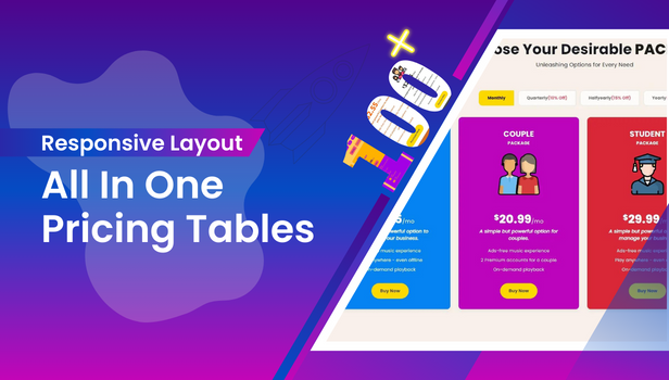
Introducing our All in One Pricing Table! This pack offers sleek pricing tables that are easy to use and look great on any device. With ten table styles, 100+ color options, and cool animations, you can make your pricing appealing. Plus, you can customize it to fit any website, whether you’re using a custom CMS or not.
But that’s not all! We’ve added some extra magic using JavaScript and JSON. JavaScript helps the tables change prices when customers click like location or discounts, making it super interactive. And JSON lets developers easily update table values in the backend, so you can tweak things effortlessly. It’s simple to use and gives you total control over your pricing tables.
Why All in One Pricing Table?
Compared to other Price Tables available in the market, our All in One Pricing Table is dynamic as one can change theme color, theme fonts. Both headers and period-headers can be changed and updated, Pricing can be changed, and necessary links can be attached. One can hide or show all the headers and period-headers or can hide or show them individually as required. All these can be done just by handling the configsection.
Responsive Layout
Our Pricing Tables seamlessly adjust to fit any mobile device, tablet, or browser, ensuring a perfect display every time.
Retina Ready
Our Pricing Tables are optimized for high-resolution displays, guaranteeing sharp and clear visuals regardless of your user’s screen quality.
Pixel Perfect
Our Pricing Table is carefully designed with great attention to detail. Every part of the table looks perfect, down to the smallest pixel.
Multiple Color Versions
CSS3 Pricing Tables provide 10 distinct designs, each offering a selection of over 100 color variations to suit your preferences.
Active Default Column
Set any column as active by default.
Extended Features List
- Utilizes Pure CSS, HTML, JavaScript, JQuery and JSON,
- Fully Responsive Design,
- Enhanced for Retina Displays,
- Offers 10 Unique Table Styles,
- Over 100 Color Variations Available,
- Offers 3 Ribbon Styles with Unlimited Color Options,
- Active Column Functionality,
- Ability to disable plans upon stockout,
- Supports Font-Face Fonts,
- Animated Hover Effects,
- Comprehensive Documentation Included.
Browser Support
- Firefox: Supported from version 3.5 and above
- Opera: Supported from version 11 and above
- Safari: Supported from version 5 and above
- Chrome – Fully Support
- Internet Explorer: Supported from version 9 and above
Support Timing
This item comes with support. You can ask questions on our Support Page. We operate during weekdays within the GMT +6 time zone. Our commitment is to respond to all inquiries within a 24-hour timeframe, though occasionally it may extend to 48 hours. Should you reach out to us during weekends or holidays, rest assured that we will promptly address your query on the subsequent business day.
1000+ Satisfied Customers
Over 1,000 customers trust us. Our team consists of dedicated individuals with over 8 years of experience, including 1 year on Envato Market. We focus on WordPress, plugins, Templates, design, and development. Stay updated by following us as we create more great works.
Updates
28.05.2024 – v1.2
- Color changed for Design 1 and Design 3.
- Minor HTML Changes.
- Reduced Unnecessary CSS to avoid complexity.
- Updated the Configuration (JSON) structure for better stability and views.
- Minor JS Changes.
11.05.2024 – v1.1
- Added New Ribbons in 3 styles with Multiple Color Variations.
- Updated the Configuration (JSON) with New Ribbon Features.
- Updated the Configuration (JSON) with New Period Header Setting for Every Individual Header
- Fixed Minor Incompatibility with Bootstrap.
- Minor JS Changes.
- Minor CSS Changes.
25.04.2024 – v1.0
- The inaugural release of the All in One Pricing Tables.
Main Features
- Signin / Signup Left Layout
- Signin / Signup Right Layout
- 3 Layouts
- Light or Dark Version
- Clean Code and Well Commented
- W3C Validate Code
- Bootstrap 4x
- Built with CSS3
- Used Google Fonts
- Mobile Responsive
- Easy To Customize
- Free Update
- Free 24/7 Support
- And Much More…
Sources and Credits
Demo Access
https://denthemes.com/themes/codes/startu
Support Email
If you have any issues or any questions, please feel free to contact us at support page. Additionally, detailed documentation is provided with the product to assist you with setup and customization.
[email protected]
Version
Version: 1.0.0
Initial Release
]]>
Description:
The Simple to Implement Progress Bar package offers a hassle-free solution for integrating progress bars into your web projects with minimal effort. Crafted using just <HTML> and <CSS>, this package ensures easy implementation across various web development environments. With options for customization including color, size, and thickness, you have the flexibility to adapt the progress bar to match your project’s aesthetic seamlessly.
Features:
- HTML & CSS Based: Built using only
<HTML>and<CSS>, this progress bar package eliminates the need for complex JavaScript integration, ensuring straightforward implementation across different platforms. - Easy to Implement: The package comes with clear and concise documentation, making it accessible for developers of all skill levels. Simply copy and paste the provided code snippets to incorporate the progress bar into your project effortlessly.
- Customization Options: Tailor the progress bar to suit your project’s design requirements with customizable features such as color, size, and thickness. Whether you prefer a sleek and minimalistic look or a vibrant and eye-catching design, the customization options offer versatility to meet your needs.
- Cross-Browser Compatibility: Ensuring compatibility with all popular web browsers including Chrome, Safari, Firefox, Opera, and more, the progress bar package delivers a consistent user experience across different platforms.
- Responsive Design: The progress bar is designed to be responsive, adapting seamlessly to various screen sizes and devices. Whether viewed on desktops, laptops, tablets, or smartphones, the progress bar maintains its functionality and aesthetic appeal.
- Lightweight Solution: With an emphasis on simplicity and efficiency, the progress bar package is lightweight, minimizing page load times and enhancing overall performance.
Included in the Package:
<HTML>template for implementing the progress bar.<CSS>stylesheet for styling and customization.- Comprehensive documentation with step-by-step instructions for integration and customization.
- Example files demonstrating different customization options and usage scenarios.
Benefits:
- Save time and effort with a straightforward implementation process.
- Enhance the user experience with visually appealing progress indicators.
- Enjoy flexibility and control over the design with customizable features.
- Ensure compatibility across various web browsers and devices.
- Improve performance with a lightweight and efficient solution.
Get Started Today:
Empower your web projects with the Simple to Implement Progress Bar package and elevate the user experience with sleek and customizable progress indicators. Purchase now and streamline the integration of progress bars into your web development projects.
Version 1.0.0 – 04 April 2024
-- Initial Release]]>
- High Performance
- Fully Responsive
- Easy Customiztion
- Css Variables
- Pure Css3
- dark & light mode
- Pure Js
- No Jquery
- No Js Libraries
- Custom Menu Icon
- Simple
- You can start from there by adding your own sections
- Clickable
- Well Documented
- Html Documentation With Images
How to Edit:
You need to have text editor program installed on your system. Just open files in code writer and edit them easily.
Files Included:
- Documentation folder
- Font-awesome folder
- css folder contains of menu-icon.css and main.css
- js file: main.js
- html file: index.html
- placehoder image for logo
Credits
- All icons from: FontAwsome
Features:
- Creative, Modern, and Clean Design
- 8 Different Responsive Service Sections
- Ready to Use
- Built with HTML5 & CSS3
- W3C Validate Code
- SASS CSS
- Fully Responsive
- Clean and Commented Code
- Easy to Use
- Well Documentation
- Easy Customization
- Free Future Updates
- 24/7 Awesome Support
- And Many More…
For Developers:
- You can boost your development with ServiceXtra on HTML and CSS
Browser Compatibility:
- Chrome (Windows, Mac, Linux) Firefox (Windows, Mac, Linux) Safari (Mac) Microsoft Edge and Other WebKit Browsers
Files Included:
- HTML Files
- Documentation
Font Used:
Icons Used:
Please Note:
- Images used in demo are not included in download version.
Key Features:
1. User-Friendly Interface: Our intuitive design ensures that users of all levels can effortlessly navigate and utilize the app’s features, making it accessible to both tech-savvy individuals and those less familiar with technology.
2. Transaction Insights: Gain valuable insights into your financial behavior with in-depth transaction analysis. Understand where your money goes and make informed decisions to optimize your financial health.
3. Expense Attachments: Easily attach receipts and notes to transactions, creating a comprehensive record for future reference or tax purposes.
4. Customizable Categories: Tailor expense categories to your unique lifestyle. Whether you’re a student, freelancer, or a growing family, the app adapts to your needs.
5. Regular Updates: I am dedicated to improving the app continuously. Expect regular updates that enhance functionality and introduce new features, all aimed at delivering the best possible user experience.
Take charge of your financial journey today with our Budget Tracker Web App. Achieve your financial goals, reduce stress, and make informed financial decisions effortlessly.
]]>Key Features:
1. User-Friendly Interface: Our intuitive design ensures that users of all levels can effortlessly navigate and utilize the app’s features, making it accessible to both tech-savvy individuals and those less familiar with technology.
2. Transaction Insights: Gain valuable insights into your financial behavior with in-depth transaction analysis. Understand where your money goes and make informed decisions to optimize your financial health.
3. Expense Attachments: Easily attach receipts and notes to transactions, creating a comprehensive record for future reference or tax purposes.
4. Customizable Categories: Tailor expense categories to your unique lifestyle. Whether you’re a student, freelancer, or a growing family, the app adapts to your needs.
5. Regular Updates: I am dedicated to improving the app continuously. Expect regular updates that enhance functionality and introduce new features, all aimed at delivering the best possible user experience.
Take charge of your financial journey today with our Budget Tracker Web App. Achieve your financial goals, reduce stress, and make informed financial decisions effortlessly.
]]>Key Features of Responsive Accordion:
Fully Responsive Design: Our accordion is meticulously crafted to ensure flawless display and functionality across all devices, from desktops to tablets to smartphones. This means your content will look great and work perfectly no matter where it's viewed.Easy Integration: With simplicity in mind, Responsive Accordion can be easily integrated into any website or application. It supports HTML, CSS, and JavaScript, making it a versatile choice for various web development projects.Highly Customizable: Tailor the accordion to match your site’s design and feel. From colors, fonts, and sizes to more complex elements like animation speeds and start states, you have the power to make it uniquely yours.Smooth Animations: The accordion comes with a variety of elegant animation options that enhance user experience without compromising on performance. These animations are designed to be lightweight and smooth, ensuring that they work seamlessly even on lower-end devices.Cross-Browser Compatibility: Our product is rigorously tested across all major browsers to ensure consistent performance and appearance, eliminating the need for you to deal with browser-specific quirks.Developer Support and Documentation: Responsive Accordion comes with comprehensive documentation and sample code to get you started quickly. Plus, our dedicated support team is here to assist you with any questions or challenges you may encounter.Whether you’re building a FAQ section, product details page, or any content that benefits from a compact and organized display, the UltraResponsive Accordion is the perfect solution to enhance your website’s user experience and design. Elevate your projects and impress your clients with the sophistication and functionality of the UltraResponsive Accordion. Try it today and see the difference it can make! Ch
]]>Features:
- Built with Tailwind CSS 3.4.1
- Creative, modern, and clean design
- Dark Theme Available
- RTL Theme Available
- Built with CSS3
- Clean Code
- HTML5 and CSS3 Markup
- Based on Javascript
- Used Google Fonts
- Well Documented
- Easy to Customize
- Well Documented
- Retina Ready
- Multi-Browser Support
- W3C Validate Code
- Fully Responsive
- Clean and commented code
- And Much More…...
Features:
- Built with Tailwind CSS 3.4.1
- Creative, modern, and clean design
- Dark Theme Available
- RTL Theme Available
- Built with CSS3
- Clean Code
- HTML5 and CSS3 Markup
- Based on Javascript
- Used Google Fonts
- Well Documented
- Easy to Customize
- Well Documented
- Retina Ready
- Multi-Browser Support
- W3C Validate Code
- Fully Responsive
- Clean and commented code
- And Much More…...
CardWizards – your toolkit for stunning web designs! With 75+ sleek card styles, including product showcases, bookings, blogs, user profiles, authentications, teams, testimonials and more it’s easy to create modern layouts. Just plug in with Tailwind CSS v3+, and you’re set! Responsive, easy setup, and 24/7 support make CardWizards the ultimate choice for your next project.


Read Documentation:
Key Feature:
- Html, CSS, JavaScript and TailwindCSS
- Built with the Latest Tailwind CSS V3+
- 75+ different various Card Styles
- 8+ Product Card Styles
- 10+ Authentication Card Styles
- 8+ Product Card Styles
- 6+ Blog Card Styles
- 7+ Team Card Styles
- 8+ Modal Card Styles
- 7+ Booking Card Styles
- 9+ User Profile Card Styles
- 6+ Testimonial Card Styles
- 4+ Services Profile Card Styles
- 4+ Pricing Card Styles
- Modern and Clean Design
- Glass morphism Design included
- Comes with Comprehensive Documentation and Clean Code
- Quick and Easy Setup
- Clean and commented code
- W3 Validated Code
- Ensures 100% Responsive Layouts
- Available in both Light and Dark Modes
- 24/7 Customer Support
Files Included:
- authentication-cards.html
- blog-cards.html
- booking-cards.html
- index.html
- modal-cards.html
- pricing-cards.html
- product-cards.html
- service-cards.html
- team-cards.html
- testimonial-cards.html
- user-profile-cards.html
- one html documentation file
Source & Credits:
- Google Fonts
- Talwind CSS 3+
- Font Awesome
- FreepiK
- Autoprefixer
- PostCSS
Please Note:
Note: All images are just used for Preview Purpose Only. They are not part of the html templates and no included in the final purchase files.
]]>CardWizards – your toolkit for stunning web designs! With 75+ sleek card styles, including product showcases, bookings, blogs, user profiles, authentications, teams, testimonials and more it’s easy to create modern layouts. Just plug in with Tailwind CSS v3+, and you’re set! Responsive, easy setup, and 24/7 support make CardWizards the ultimate choice for your next project.
Read Documentation:
Key Feature:
- Html, CSS, JavaScript and TailwindCSS
- Built with the Latest Tailwind CSS V3+
- 75+ different various Card Styles
- 8+ Product Card Styles
- 10+ Authentication Card Styles
- 8+ Product Card Styles
- 6+ Blog Card Styles
- 7+ Team Card Styles
- 8+ Modal Card Styles
- 7+ Booking Card Styles
- 9+ User Profile Card Styles
- 6+ Testimonial Card Styles
- 4+ Services Profile Card Styles
- 4+ Pricing Card Styles
- Modern and Clean Design
- Glass morphism Design included
- Comes with Comprehensive Documentation and Clean Code
- Quick and Easy Setup
- Clean and commented code
- W3 Validated Code
- Ensures 100% Responsive Layouts
- Available in both Light and Dark Modes
- 24/7 Customer Support
Files Included:
- authentication-cards.html
- blog-cards.html
- booking-cards.html
- index.html
- modal-cards.html
- pricing-cards.html
- product-cards.html
- service-cards.html
- team-cards.html
- testimonial-cards.html
- user-profile-cards.html
- one html documentation file
Source & Credits:
- Google Fonts
- Talwind CSS 3+
- Font Awesome
- FreepiK
- Autoprefixer
- PostCSS
Please Note:
Note: All images are just used for Preview Purpose Only. They are not part of the html templates and no included in the final purchase files.
]]>At its core, Responsive Tab utilizes HTML, CSS, and JavaScript to create a sleek and responsive tabbed layout. One of its key features is its ability to automatically adjust the tab layout based on the available screen space, ensuring an optimal viewing experience for users on both desktop and mobile devices.
Here’s how Responsive Tabs works:
1. Flexible Layout: Responsive Tabs intelligently adjusts the tab layout based on the screen width. On larger screens, tabs may be displayed side by side, while on smaller screens, they may stack vertically or transform into a dropdown menu, providing a seamless transition between different viewports.
2. Customization Options: Users have the flexibility to customize various aspects of the tabbed interface, including colors, styles, animations, and transition effects, to match their website’s design aesthetic and branding requirements.
3. Easy Integration: Integrating Responsive Tabs into a website is straightforward, requiring minimal coding knowledge. Users can simply include the necessary CSS and JavaScript files, configure the tab structure and content using HTML markup, and initialize the plugin with a few lines of JavaScript code.
4. Compatibility: Responsive Tabs is designed to be compatible with all modern web browsers, ensuring consistent performance and functionality across a wide range of platforms and devices.
Whether it’s for showcasing product features, organizing informational content, or presenting portfolio items, Responsive Tabs provides a versatile solution for implementing tabbed interfaces that are not only visually appealing but also highly functional and accessible.
With its intuitive design, robust features, and seamless responsiveness, Responsive Tabs empowers web developers to create engaging and user-friendly tabbed layouts that elevate the browsing experience for their audience.
]]>Key Features:-
Fully Responsive Design: Our slider adapts flawlessly to any screen size and resolution, ensuring your images look spectacular on every device, from desktops to smartphones. This guarantees an optimal viewing experience for all your visitors, no matter how they access your site.
Automatic Transitions: With smooth, customizable transitions, our carousel keeps your content dynamic and engaging. Set your preferred timing, choose from a variety of animation styles, and let your images do the talking, keeping your audience captivated without manual navigation.
Touch & Swipe Support: Modernize your user experience with intuitive touch and swipe capabilities, allowing mobile and tablet users to effortlessly navigate through your images. This feature enhances usability and accessibility, making your site friendly to a wider audience.
Easy Integration & Customization: Our slider is designed for simplicity, allowing for easy integration into your existing website framework. With extensive customization options, you can align the carousel’s appearance and functionality with your site’s design and branding, ensuring a cohesive and unique user experience.
Lightweight & Fast: Performance is paramount, and our coding product is built to be lightweight, ensuring that it doesn’t slow down your website. Enjoy fast loading times, keeping your bounce rates low and your visitors happy.
]]>Elevate user engagement with QuestionAsked. Effortlessly captures and retains attention through its visually appealing elements and dynamic effects. The responsive layout ensures optimal performance across various devices, allowing users to interact with style and convenience.
QuestionAsked – Frequently Asked Questions Template boasts a sleek and customizable design, making it perfect for blogs, media outlets, or any web page requiring an interactive and visually stunning presentation. Developed with the latest Tailwind CSS v3 framework, it seamlessly combines sophistication with enhanced functionality, ensuring a seamless and polished design.
With its responsive layout and customizable features, QuestionAsked ensures a smooth and captivating user experience, making it the ideal choice to redefine your website’s presentation.
Choose QuestionAsked to showcase a polished design and contemporary aesthetics. The Tailwind CSS integration remains, allowing for a streamlined development process and easy customization to match your brand’s unique style.
Features:
- 10 Variants Frequently Asked Questions Demo
- Based on Tailwind CSS v3.4
- Clean Code
- HTML5 and CSS3 Markup
- W3C Valid Markup
- Clean, Modern, Minimal & Creative Design
- Fully Responsive Layout
- Customizing Countdown Display
- Used Google Fonts
- Well Documented
- Easy to Customize
- Well Documented
- Retina Ready
- Multi-Browser Support
- And Much More…...
Elevate user engagement with QuestionAsked. Effortlessly captures and retains attention through its visually appealing elements and dynamic effects. The responsive layout ensures optimal performance across various devices, allowing users to interact with style and convenience.
QuestionAsked – Frequently Asked Questions Template boasts a sleek and customizable design, making it perfect for blogs, media outlets, or any web page requiring an interactive and visually stunning presentation. Developed with the latest Tailwind CSS v3 framework, it seamlessly combines sophistication with enhanced functionality, ensuring a seamless and polished design.
With its responsive layout and customizable features, QuestionAsked ensures a smooth and captivating user experience, making it the ideal choice to redefine your website’s presentation.
Choose QuestionAsked to showcase a polished design and contemporary aesthetics. The Tailwind CSS integration remains, allowing for a streamlined development process and easy customization to match your brand’s unique style.
Features:
- 10 Variants Frequently Asked Questions Demo
- Based on Tailwind CSS v3.4
- Clean Code
- HTML5 and CSS3 Markup
- W3C Valid Markup
- Clean, Modern, Minimal & Creative Design
- Fully Responsive Layout
- Customizing Countdown Display
- Used Google Fonts
- Well Documented
- Easy to Customize
- Well Documented
- Retina Ready
- Multi-Browser Support
- And Much More…...
Files Included: index.html
Features: Sign In Form Easy to use Fully responsive Easily customize yourself Easy to install on any site Build with Bootstrap Great user experience on any screen size or resolution
What do you get? HTML File Documentation
]]>Files Included: index.html
Features: Sign In Form Easy to use Fully responsive Easily customize yourself Easy to install on any site Build with Bootstrap Great user experience on any screen size or resolution
What do you get? HTML File Documentation
]]>Features:
- HTML, CSS and JavaScript Only.
- 24 Button collections & 192 unique button styles.
- Developer Friendly Code.
- Well-Organized, Commented & Clean Code.
- Easy to setup.
- Fast Loading Speed and attractive.
- Ensure Cross-Browser Compatibility.
- Full Responsiveness design.
Need Support?
If you have any doubts, question or difficulty regarding this item, please feel free to message us from Envato Profile Page Contact form. If you like our product, Please rate our product.]]>Features:
- HTML, CSS and JavaScript Only.
- 24 Button collections & 192 unique button styles.
- Developer Friendly Code.
- Well-Organized, Commented & Clean Code.
- Easy to setup.
- Fast Loading Speed and attractive.
- Ensure Cross-Browser Compatibility.
- Full Responsiveness design.
Need Support?
If you have any doubts, question or difficulty regarding this item, please feel free to message us from Envato Profile Page Contact form. If you like our product, Please rate our product.]]>- no Js required
- circular & vertical & horizontal & 3 linear progresses included
- Responsive
- Easy to Customize colors and sizes
- Pure CSS with Variables
- Well documentated
- Compatible with IE, Firefox, Safari, Opera, Chrome, Edge
- Structured Folder: each progress in separate folder
Files & Folders included in each progress folder:
- css files: css file for progress, boostrap file
- html file
- Documentation folder
Edit progress:
You need to have text editor program installed on your system. Just open files in code writer and edit them easily.
Credits:
- Bootstrap 5
- Firebase: free hosting for preview
- no Js required
- circular & vertical & horizontal & 3 linear progresses included
- Responsive
- Easy to Customize colors and sizes
- Pure CSS with Variables
- Well documentated
- Compatible with IE, Firefox, Safari, Opera, Chrome, Edge
- Structured Folder: each progress in separate folder
Files & Folders included in each progress folder:
- css files: css file for progress, boostrap file
- html file
- Documentation folder
Edit progress:
You need to have text editor program installed on your system. Just open files in code writer and edit them easily.
Credits:
- Bootstrap 5
- Firebase: free hosting for preview
Key Features:
Fully Responsive Design: Our slider adapts flawlessly to any screen size and resolution, ensuring your images look spectacular on every device, from desktops to smartphones. This guarantees an optimal viewing experience for all your visitors, no matter how they access your site.Automatic Transitions: With smooth, customizable transitions, our carousel keeps your content dynamic and engaging. Set your preferred timing, choose from a variety of animation styles, and let your images do the talking, keeping your audience captivated without manual navigation.Touch & Swipe Support: Modernize your user experience with intuitive touch and swipe capabilities, allowing mobile and tablet users to effortlessly navigate through your images. This feature enhances usability and accessibility, making your site friendly to a wider audience.Easy Integration & Customization: Our slider is designed for simplicity, allowing for easy integration into your existing website framework. With extensive customization options, you can align the carousel's appearance and functionality with your site's design and branding, ensuring a cohesive and unique user experience.Lightweight & Fast: Performance is paramount, and our coding product is built to be lightweight, ensuring that it doesn't slow down your website. Enjoy fast loading times, keeping your bounce rates low and your visitors happy.Benefits:
Enhanced User Engagement: Captivate your audience with a visually appealing and interactive image carousel, significantly increasing the time spent on your site and improving engagement metrics.Improved Aesthetics: Elevate the look and feel of your website with professional, sleek, and modern image displays that enhance your overall brand image.Increased Conversion Rates: By strategically showcasing your key products, services, or content, our slider can help guide visitors toward your conversion goals, be it sales, sign-ups, or inquiries.Versatility: Whether for product galleries, portfolio showcases, customer testimonials, or promotional banners, our image slider/carousel is versatile enough to fit various content types and applications.Key Features:
Fully Responsive Design: Our slider adapts flawlessly to any screen size and resolution, ensuring your images look spectacular on every device, from desktops to smartphones. This guarantees an optimal viewing experience for all your visitors, no matter how they access your site.Automatic Transitions: With smooth, customizable transitions, our carousel keeps your content dynamic and engaging. Set your preferred timing, choose from a variety of animation styles, and let your images do the talking, keeping your audience captivated without manual navigation.Touch & Swipe Support: Modernize your user experience with intuitive touch and swipe capabilities, allowing mobile and tablet users to effortlessly navigate through your images. This feature enhances usability and accessibility, making your site friendly to a wider audience.Easy Integration & Customization: Our slider is designed for simplicity, allowing for easy integration into your existing website framework. With extensive customization options, you can align the carousel's appearance and functionality with your site's design and branding, ensuring a cohesive and unique user experience.Lightweight & Fast: Performance is paramount, and our coding product is built to be lightweight, ensuring that it doesn't slow down your website. Enjoy fast loading times, keeping your bounce rates low and your visitors happy.Benefits:
Enhanced User Engagement: Captivate your audience with a visually appealing and interactive image carousel, significantly increasing the time spent on your site and improving engagement metrics.Improved Aesthetics: Elevate the look and feel of your website with professional, sleek, and modern image displays that enhance your overall brand image.Increased Conversion Rates: By strategically showcasing your key products, services, or content, our slider can help guide visitors toward your conversion goals, be it sales, sign-ups, or inquiries.Versatility: Whether for product galleries, portfolio showcases, customer testimonials, or promotional banners, our image slider/carousel is versatile enough to fit various content types and applications.Features:
- 22 Variants SweetAlert2 Demo
- Based on Tailwind CSS v3.4
- Clean Code
- HTML5 and CSS3 Markup
- W3C Valid Markup
- Clean, Modern, Minimal & Creative Design
- Fully Responsive Layout
- Customizing Countdown Display
- Used Google Fonts
- Well Documented
- Easy to Customize
- Well Documented
- Retina Ready
- Multi-Browser Support
- And Much More…...
Features:
- 22 Variants SweetAlert2 Demo
- Based on Tailwind CSS v3.4
- Clean Code
- HTML5 and CSS3 Markup
- W3C Valid Markup
- Clean, Modern, Minimal & Creative Design
- Fully Responsive Layout
- Customizing Countdown Display
- Used Google Fonts
- Well Documented
- Easy to Customize
- Well Documented
- Retina Ready
- Multi-Browser Support
- And Much More…...
- Animated when scrolling
- circular & vertical & horizontal & 3 linear progresses included
- Responsive
- Easy to Customize colors and sizes
- Pure CSS with Variables
- Vanilla javascript
- CSS3 Animations
- Well documentated
- Compatible with IE, Firefox, Safari, Opera, Chrome, Edge
- No libraries for animations
- Structured Folder: each progress in separate folder
Files & Folders included in each progress folder:
- css files: css file for progress, boostrap file
- js file
- html file
- Documentation folder
Edit progress:
You need to have text editor program installed on your system. Just open files in code writer and edit them easily.
Credits:
- Bootstrap 5
- Firebase: free hosting for preview
It’s the ideal choice for creating intuitive and dynamic tabbed interfaces. With 6 layouts and a palette of 12 vibrant colors, but also full responsiveness, it ensures a seamless user experience across multiple devices. Furthermore, its user-friendly and intuitive architecture makes it a versatile and efficient solution for your web development needs.
Features
- 6 Layouts:: Choose from six carefully designed layouts to suit your aesthetic and functional preferences.
- 12 colors: Explore a selection of 12 colors, offering a wide range of options to customize the guides to match your project’s visual identity.
- Uncomplicated Customization: Easily edit the design of the tabs, including colors, content, through intuitive and well-structured HTML, CSS and JavaScript files.
- Fully Responsive: Ensure a consistent user experience across devices of different sizes, from desktops to mobile devices.
- Simplified Integration:Simply choose the desired layout or color, copy the corresponding files and integrate them directly into your application. It’s easy and efficient!
Crafted with versatility in mind, BlogFlex’s Blog section serves as a showcase for Tailwind CSS’s dynamic features. With classes like flex, pt-4, text-center, and rotate-90, you can effortlessly create diverse designs directly within your HTML markup. The template is optimized for superior performance across various devices, ensuring a user-friendly and customizable experience.
Beyond its visual appeal, BlogFlex’s Blog section prioritizes speed, flexibility, and reliability. Thanks to Tailwind CSS, these qualities are achieved without the need for any runtime, making it a hassle-free choice for your projects. Whether you’re a seasoned developer or just starting out, BlogFlex provides a solid foundation for tailoring your Blog section to meet the specific requirements of your project.
Key Features
- Tailwind Multipule Blog Section Template
- Based on Tailwind CSS v3.4
- Built with HTML5 & CSS3
- Explore 9 contemporary and distinctive demos
- Gulp Base Setup
- Fully Responsive
- Easy to Customize
- Cross Browser Optimization
- Clean code
- Pixel Perfect Design
- Modern and Clean Design
- Built with Google Font
- And Much More…
Browser Compatibility:
- Chrome (Windows, Mac, Linux)
- Firefox (Windows, Mac, Linux)
- Safari (Mac)
- Microsoft Edge
- Microsoft Edge
- And other WebKit browsers
Please Note: Images used in the demo are not included in the download version.
]]>Crafted with versatility in mind, BlogFlex’s Blog section serves as a showcase for Tailwind CSS’s dynamic features. With classes like flex, pt-4, text-center, and rotate-90, you can effortlessly create diverse designs directly within your HTML markup. The template is optimized for superior performance across various devices, ensuring a user-friendly and customizable experience.
Beyond its visual appeal, BlogFlex’s Blog section prioritizes speed, flexibility, and reliability. Thanks to Tailwind CSS, these qualities are achieved without the need for any runtime, making it a hassle-free choice for your projects. Whether you’re a seasoned developer or just starting out, BlogFlex provides a solid foundation for tailoring your Blog section to meet the specific requirements of your project.
Key Features
- Tailwind Multipule Blog Section Template
- Based on Tailwind CSS v3.4
- Built with HTML5 & CSS3
- Explore 9 contemporary and distinctive demos
- Gulp Base Setup
- Fully Responsive
- Easy to Customize
- Cross Browser Optimization
- Clean code
- Pixel Perfect Design
- Modern and Clean Design
- Built with Google Font
- And Much More…
Browser Compatibility:
- Chrome (Windows, Mac, Linux)
- Firefox (Windows, Mac, Linux)
- Safari (Mac)
- Microsoft Edge
- Microsoft Edge
- And other WebKit browsers
Please Note: Images used in the demo are not included in the download version.
]]>Features:
- Creative, modern, and clean design
- 6 different various Responsive Blog Section
- Ready to Use
- Built with HTML5 & CSS3
- W3C Validate Code
- SASS CSS
- Fully Responsive
- Clean and commented code
- Easy to use
- Well Documentation
- Easy Customization
- Free Future Updates
- 24/7 Awesome Support
- And Many More…
For Developers:
- You can boost your development with BlogXtra on HTML and CSS
Browser Compatibility:
- Chrome (Windows, Mac, Linux) Firefox (Windows, Mac, Linux) Safari (Mac) Microsoft Edge And other WebKit browsers
Files Included:
- HTML Files
- Documentation
Font Used:
Icons Used:
Please Note:
- Images used in demo are not included in download version.
Features:
- 8 Variants footer section design
- Based on tailwind CSS v3.4
- HTML5 and CSS3 Markup
- Easy to Customize
- Clean, Modern, Minimal & Creative Design
- Fully Responsive Layout
- Fully Customizable
- W3C Valid Files
- Built with Google Font
- Well Documented
- Retina Ready
- Multi-Browser Support
- And Much More…..
Changelog:
You can easily use this script with your existing HTML, CSS Project, without need any further installation
]]>Features:
- 8 Variants footer section design
- Based on tailwind CSS v3.4
- HTML5 and CSS3 Markup
- Easy to Customize
- Clean, Modern, Minimal & Creative Design
- Fully Responsive Layout
- Fully Customizable
- W3C Valid Files
- Built with Google Font
- Well Documented
- Retina Ready
- Multi-Browser Support
- And Much More…..
Changelog:
You can easily use this script with your existing HTML, CSS Project, without need any further installation
]]>
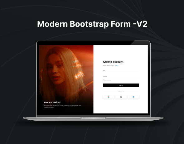
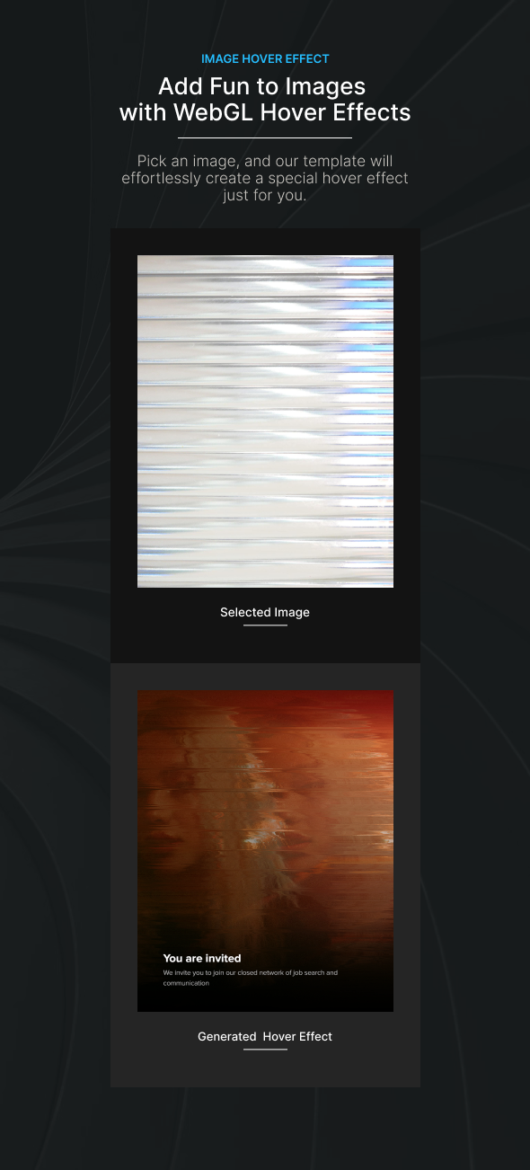
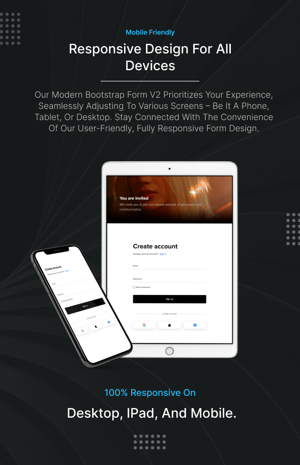
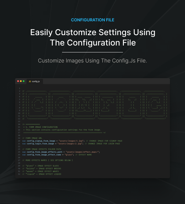
Description
Check out our latest Modern Bootstrap Form with WebGL image hover effect. It works seamlessly on all devices, and you can easily customize it to suit your needs. The intuitive design ensures a smooth user experience, while the responsive layout guarantees optimal performance across various screen sizes. Elevate your web forms with this powerful combination of modern aesthetics and user-friendly functionality.
Features
- Customizable Image Hover Effect
- Ready Made Designs
- WebGL Optimized Performance Shader
- Well commented
- 3 Unique Forms Included
- Bootstrap V5 latest version
- Well Structured Code
- Responsive and Mobile-Friendly
- Easy to Use.
Support and Documentation
If you encounter any issues or have questions, feel free to contact us at support page. Additionally, detailed documentation is provided with the product to assist you with setup and customization.
Thank you for choosing Modern Bootstrap Form – V2
We appreciate your support and hope you enjoy using our product.
]]>
Description
Check out our latest Modern Bootstrap Form with WebGL image hover effect. It works seamlessly on all devices, and you can easily customize it to suit your needs. The intuitive design ensures a smooth user experience, while the responsive layout guarantees optimal performance across various screen sizes. Elevate your web forms with this powerful combination of modern aesthetics and user-friendly functionality.
Features
- Customizable Image Hover Effect
- Ready Made Designs
- WebGL Optimized Performance Shader
- Well commented
- 3 Unique Forms Included
- Bootstrap V5 latest version
- Well Structured Code
- Responsive and Mobile-Friendly
- Easy to Use.
Support and Documentation
If you encounter any issues or have questions, feel free to contact us at support page. Additionally, detailed documentation is provided with the product to assist you with setup and customization.
Thank you for choosing Modern Bootstrap Form – V2
We appreciate your support and hope you enjoy using our product.
]]>Features:
- 12 Variants Form Section Design Demo
- Based on Tailwind CSS v3.4
- Clean Code
- HTML5 and CSS3 Markup
- W3C Valid Markup
- Clean, Modern, Minimal & Creative Design
- Fully Responsive Layout
- Customizing Countdown Display
- Used Google Fonts
- Well Documented
- Easy to Customize
- Well Documented
- Retina Ready
- Multi-Browser Support
- And Much More…...
Features:
- 12 Variants Newsletter Section Design Demo
- Based on Tailwind CSS v3.4
- Clean Code
- HTML5 and CSS3 Markup
- W3C Valid Markup
- Clean, Modern, Minimal & Creative Design
- Fully Responsive Layout
- Customizing Countdown Display
- Used Google Fonts
- Well Documented
- Easy to Customize
- Well Documented
- Retina Ready
- Multi-Browser Support
- And Much More…...
Circular progress bars offer a high degree of customization to match the visual style and branding of your application.
Key customization options include
- Color: Choose colors that align with your application’s color scheme or convey specific meanings (e.g., green for success, red for error).
- Size: Adjust the size of the progress bar to fit within the layout of your application, ensuring it is visible and unobtrusive.
- Thickness: Control the thickness of the progress bar’s stroke to achieve the desired visual weight and prominence.
Features Included:
- Pure CSS with Variables
- CSS3 Animations
- 7 predefined Color Skins
- 5+ Types design ready
- Supports multiple instances
- Works in IE, Firefox, Safari, Opera, Chrome, Edge
- Compatible with mobile devices
- No JavaScript required
- Easy to Customize
- Help file is included
Version 1.0.0 – 25 Feb 2024
-- Initial Release
Browsers Note: Works well in all latest browsers like Chrome, Firefox, Opera, Safari, Edge
Please Note: All images are just used for Preview Purpose Only. They are not part of the template and NOT included in the final purchase files.
]]>Circular progress bars offer a high degree of customization to match the visual style and branding of your application.
Key customization options include
- Color: Choose colors that align with your application’s color scheme or convey specific meanings (e.g., green for success, red for error).
- Size: Adjust the size of the progress bar to fit within the layout of your application, ensuring it is visible and unobtrusive.
- Thickness: Control the thickness of the progress bar’s stroke to achieve the desired visual weight and prominence.
Features Included:
- Pure CSS with Variables
- CSS3 Animations
- 7 predefined Color Skins
- 5+ Types design ready
- Supports multiple instances
- Works in IE, Firefox, Safari, Opera, Chrome, Edge
- Compatible with mobile devices
- No JavaScript required
- Easy to Customize
- Help file is included
Version 1.0.0 – 25 Feb 2024
-- Initial Release
Browsers Note: Works well in all latest browsers like Chrome, Firefox, Opera, Safari, Edge
Please Note: All images are just used for Preview Purpose Only. They are not part of the template and NOT included in the final purchase files.
]]>Explore our Animated Pricing for Your Website! Stand out effortlessly with our dynamic pricing tables. Upgrade now!”
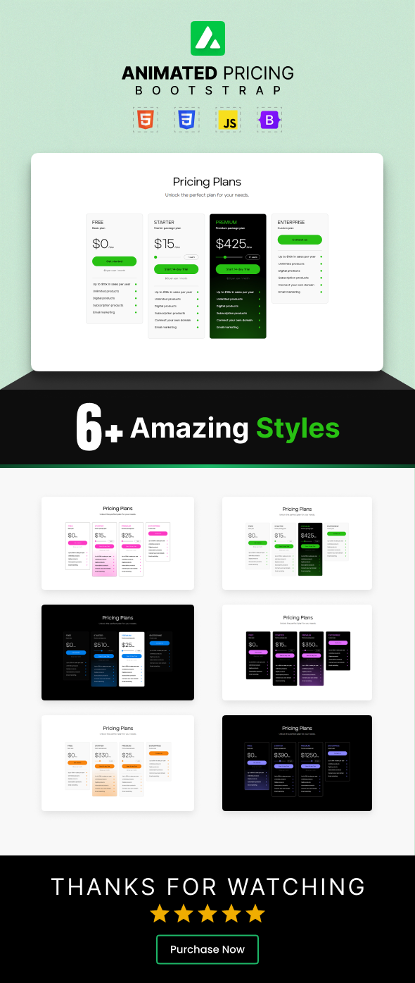
Features
- Well Documented
- Ready Made Designs
- Dynamic Price Control
- 6 Styles
- Easy To Customise
- Responsive and Mobile-Friendly
- Animated Pricing Bootstrap
Support and Documentation
If you encounter any issues or have questions, feel free to contact us at support page. Additionally, detailed documentation is provided with the product to assist you with setup and customization.
Thank you for choosing Animated Pricing Bootstrap
We appreciate your support and hope you enjoy using our product.
]]>Explore our Animated Pricing for Your Website! Stand out effortlessly with our dynamic pricing tables. Upgrade now!”
Features
- Well Documented
- Ready Made Designs
- Dynamic Price Control
- 6 Styles
- Easy To Customise
- Responsive and Mobile-Friendly
- Animated Pricing Bootstrap
Support and Documentation
If you encounter any issues or have questions, feel free to contact us at support page. Additionally, detailed documentation is provided with the product to assist you with setup and customization.
Thank you for choosing Animated Pricing Bootstrap
We appreciate your support and hope you enjoy using our product.
]]>Designed with versatility in mind, Heroda’s hero section is a showcase of Tailwind CSS capabilities. Featuring classes like flex, pt-4, text-center, and rotate-90, it empowers you to effortlessly compose diverse designs directly within your HTML markup. The template is built for optimal performance across various devices, ensuring a user-friendly and customizable experience.
Heroda’s hero section is not just visually appealing; it also prioritizes speed, flexibility, and reliability. Thanks to Tailwind CSS, all this is achieved without the need for any runtime, making it a hassle-free choice for your projects. Whether you’re a seasoned developer or just starting, Heroda offers a solid foundation for tailoring your hero section to meet the specific requirements of your project.
Key Features
- Tailwind Multipule Hero Section Template
- Based on Tailwind CSS v3.4
- Built with HTML5 & CSS3
- 8 Modern & Unique Demo
- Gulp Base Setup
- Fully Responsive
- Easy to Customize
- Cross Browser Optimization
- Clean code
- Pixel Perfect Design
- Modern and Clean Design
- Built with Google Font
- And Much More…
Browser Compatibility:
- Chrome (Windows, Mac, Linux)
- Firefox (Windows, Mac, Linux)
- Safari (Mac)
- Microsoft Edge
- Microsoft Edge
- And other WebKit browsers
Please Note: Images used in the demo are not included in the download version.
]]>Overall, the Toggle Switch Checkbox CSS3 is an elegant solution for implementing toggling functionality in web forms, settings panels, and other user interface components, offering both functionality and aesthetics to enhance the user experience.
Features Included:
- Responsive design
- Pure CSS with Variables
- CSS3 Animations
- 7 predefined Color Skins
- 4 Types
- Supports multiple instances
- Works in IE, Firefox, Safari, Opera, Chrome, Edge
- Compatible with mobile devices
- No JavaScript required
- Easy to Customize
- Help file is included
Version 1.0.0 – 20 Feb 2024
-- Initial Release
Browsers Note: Works well in all latest browsers like Chrome, Firefox, Opera, Safari, Edge
Please Note: All images are just used for Preview Purpose Only. They are not part of the template and NOT included in the final purchase files.
]]>Built on the latest Tailwind CSS v3.3.3, Formoro is a multi-purpose HTML template incorporating HTML5, SCSS, and CSS3. Its fully responsive design ensures optimal performance across various devices. Formoro is user-friendly, highly customizable, and guarantees enhanced performance, making it effortlessly adaptable to meet your specific project requirements.
Key Features
- Tailwind Multipule Form Template
- Based on Tailwind CSS v3.4
- Built with HTML5 & CSS3
- SCSS Support
- Fully Responsive
- Easy to Customize
- Cross Browser Optimization
- Clean code
- Pixel Perfect Design
- Modern and Clean Design
- Built with Google Font
- And Much More…
Browser Compatibility:
- Chrome (Windows, Mac, Linux)
- Firefox (Windows, Mac, Linux)
- Safari (Mac)
- Microsoft Edge
- Microsoft Edge
- And other WebKit browsers
Please Note: Images used in the demo are not included in the download version.
]]>Features:
- 30 Variants Social Button Design Demo
- Based on Tailwind CSS v3.4
- Clean Code
- HTML5 and CSS3 Markup
- W3C Valid Markup
- Clean, Modern, Minimal & Creative Design
- Fully Responsive Layout
- Customizing Countdown Display
- Used Google Fonts
- Well Documented
- Easy to Customize
- Well Documented
- Retina Ready
- Multi-Browser Support
- And Much More…...
Features:
- Fully Responsive design
- Tailwind CSS version 3 for seamless customization.
- 100% Responsive
- 6 different various blogs sections
- Built with HTML & CSS
- Dedicated Support
- Cross-Browser Support
- Easy to customize
- And much more…
- W3C Validate Code
- Well-documented
Changelog:
You can easily use this script with your existing HTML, and CSS Project, without needing any further installation
]]>Features:
- Built with Bootstrap v5.3.2
- Creative, modern, and clean design
- Built with CSS3
- Clean Code
- HTML5 and CSS3 Markup
- 6 Authentication Pages
- Used Google Fonts
- Well Documented
- Easy to Customize
- Well Documented
- Retina Ready
- Multi-Browser Support
- W3C Validate Code
- Fully Responsive
- Clean and commented code
- And Much More…...
Features:
- Built with Bootstrap v5.3.2
- Creative, modern, and clean design
- Built with CSS3
- Clean Code
- HTML5 and CSS3 Markup
- 6 Authentication Pages
- Used Google Fonts
- Well Documented
- Easy to Customize
- Well Documented
- Retina Ready
- Multi-Browser Support
- W3C Validate Code
- Fully Responsive
- Clean and commented code
- And Much More…...
Explore a stylish and modern grid layout. Available in 6 differnet styles.
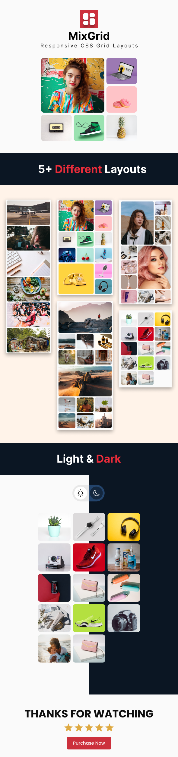
Features
- Well Documented
- Ready Made Designs
- 5+ Different Styles
- Easy To Customise
- Responsive and Mobile-Friendly
- MixGrid – Responsive CSS Layouts
Support and Documentation
If you encounter any issues or have questions, feel free to contact us at support page. Additionally, detailed documentation is provided with the product to assist you with setup and customization.
Thank you for choosing MixGrid – Responsive CSS Layouts
We appreciate your support and hope you enjoy using our product.
]]>Explore a stylish and modern grid layout. Available in 6 differnet styles.
Features
- Well Documented
- Ready Made Designs
- 5+ Different Styles
- Easy To Customise
- Responsive and Mobile-Friendly
- MixGrid – Responsive CSS Layouts
Support and Documentation
If you encounter any issues or have questions, feel free to contact us at support page. Additionally, detailed documentation is provided with the product to assist you with setup and customization.
Thank you for choosing MixGrid – Responsive CSS Layouts
We appreciate your support and hope you enjoy using our product.
]]>